Components
Thirty-one shadcn primitives, thirteen application components with thirty exports between them, thirteen marketing blocks, and the rule about which layer you reach for.
Four layers, and the rule is: reach for the highest one that fits. Building a page out of primitives when an application component exists is how three products built on this template ended up looking like one product.
| layer | lives in | knows about | upgraded by us? |
|---|---|---|---|
| primitives | src/components/ui | nothing. A button is a button. | no — they are shadcn's, and the first thing anyone restyles |
| application | src/components/app | tables, page shells, statuses — not your product | yes, they are @lq-managed |
| marketing | src/components/blocks | the public page — hero, pricing, FAQ, the footer | no, and the section order is a positioning decision |
| feature | src/features/*/components | invoices, tickets, bookings | no, they are yours |
The application layer is the one most starters do not have, and it is where the design decisions live.
Blocks and application components divide by audience rather than by shape. A
block is a full-width band of the public site and takes its words from
src/config/marketing.ts; an application component is a piece of a signed-in
screen and takes its words as props. If you are building something a logged-out
visitor sees, reach for a block.
The application layer
Composed, opinionated, product-agnostic. It may import primitives and its own
siblings; it may not import a feature — the boundaries graph rejects that
edge, because a PageHeader that knows what a project is cannot be reused by
the next product and cannot be regenerated.
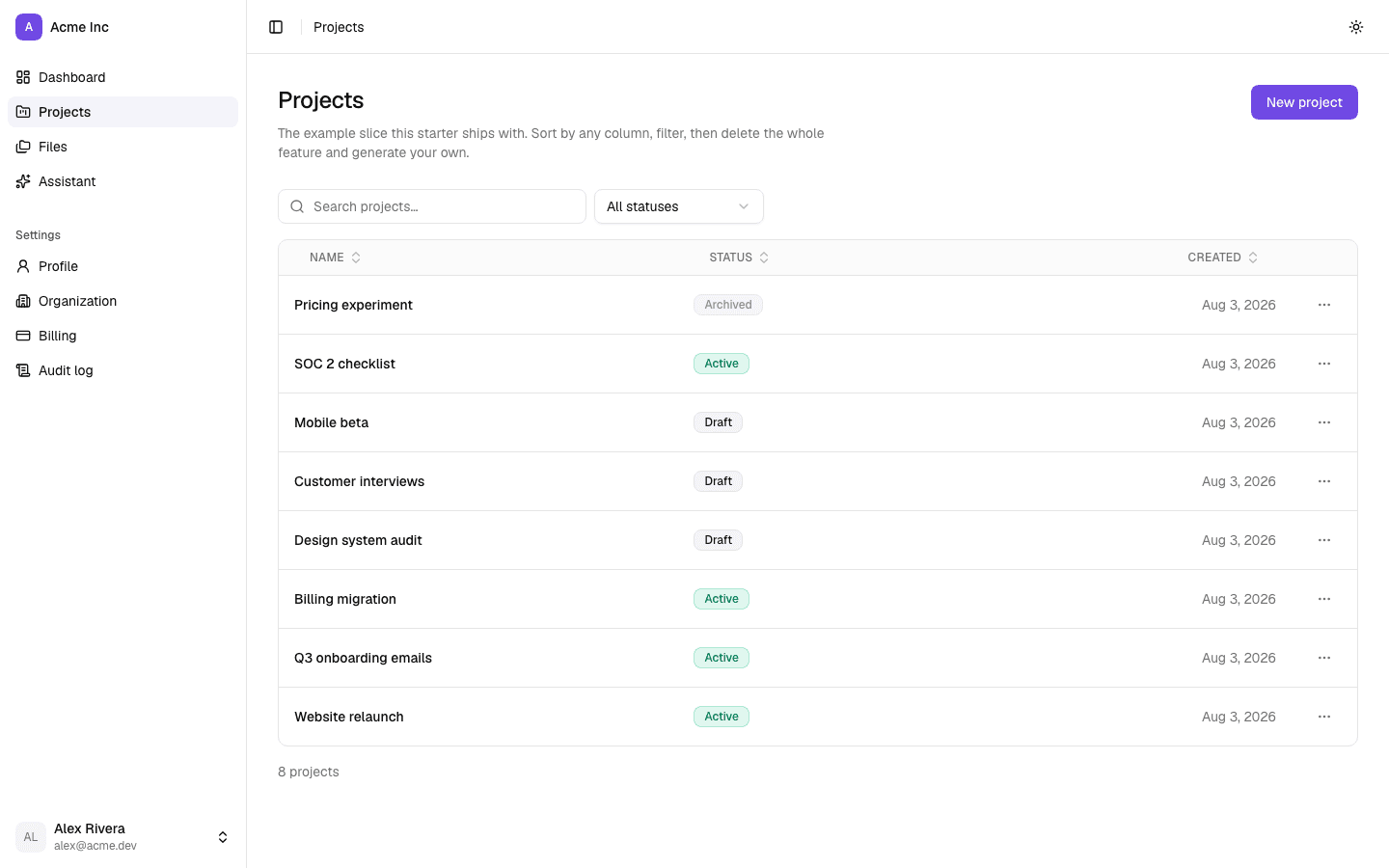
Page structure
| export | file | for |
|---|---|---|
PageShell | page-shell.tsx | every page. width is list, detail, form or full |
PageHeader | page-header.tsx | the single <h1>, a description, actions, and badges beneath |
Width is a property of the content, not a number you pick per page. Every route
in all three fleet products was max-w-3xl: a 224px dead gutter beside a
six-column table, and far too wide for a form, where an input stretched
full-width reads as a search box.
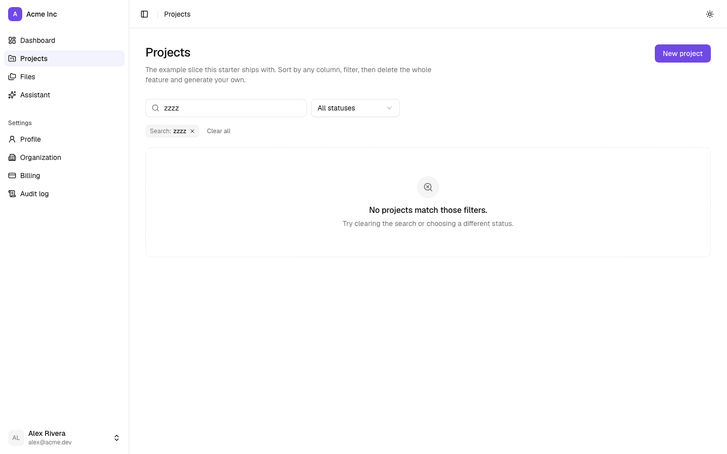
Lists
| export | file | for |
|---|---|---|
DataTable | data-table.tsx | the frame; sticks the header |
SortableHead | data-table.tsx | sorting as URL state, announced with aria-sort |
RowActions | data-table.tsx | the per-row menu |
TableFooterBar | data-table.tsx | the result count and pagination strip |
FilterBar | filter-bar.tsx | the controls above a list |
FilterSearch, FilterSelect | filter-bar.tsx | a search box, and the styled enum filter |
FilterChip | filter-bar.tsx | one active filter, with the control that removes it |
EmptyState | empty-state.tsx | both empty cases, with an icon slot |
The count is not decoration — it is the only thing distinguishing "no results" from "results, but you are on page 7 of them". The chips are the part everyone skips: without them, someone who opens a shared URL carrying three filters sees a short list and no explanation.
One record
| export | file | for |
|---|---|---|
DetailLayout | detail-layout.tsx | body column plus metadata rail |
DetailFacts, DetailFact | detail-layout.tsx | the rail, and one labelled value in it |
DetailSection | detail-layout.tsx | a titled block in the body column |
This replaces a <dl> of String(value ?? '—') where a memo carried exactly as
much visual weight as an amount.
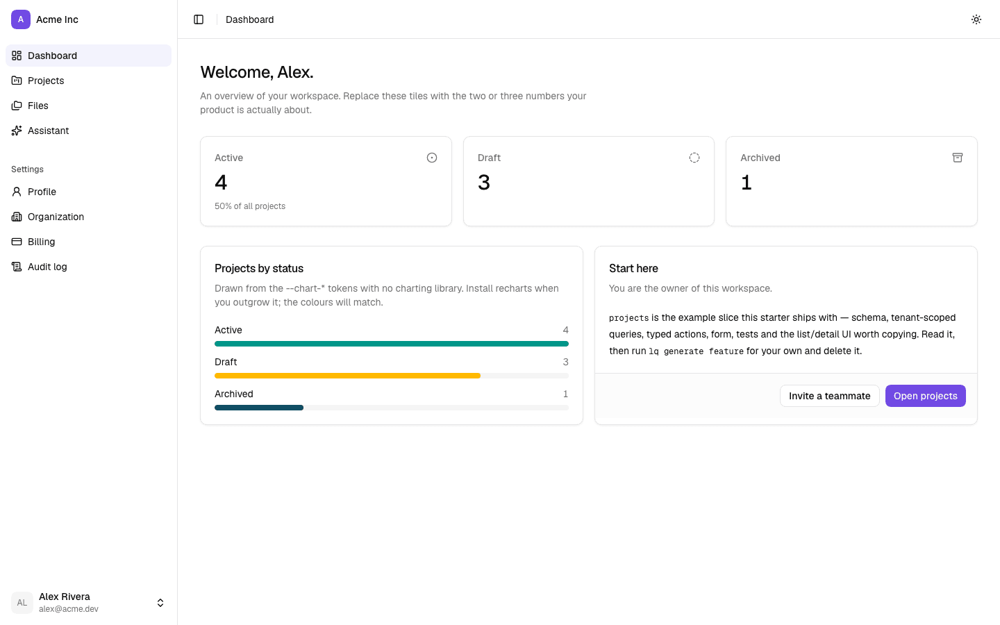
Dashboards
| export | file | for |
|---|---|---|
StatCard, StatCardGrid | stat-card.tsx | a number, with a delta, an icon and an href |
ChartCard | chart-card.tsx | the panel |
BarChart, CategoryBars | chart-card.tsx | small charts on the --chart-* tokens, no library |
ChartSeries | chart-card.tsx | the series type, 1–5 |
Give every tile an href. A number you can click is a number you can act on —
the one idea worth copying from the best of the three fleet dashboards, all of
which were otherwise three unlinked numbers in three boxes.
The rest
| export | file | for |
|---|---|---|
SectionCard | section-card.tsx | a titled panel — settings groups, summaries |
ConfirmDialog | confirm-dialog.tsx | anything destructive; works from a row menu |
DrawerForm | drawer-form.tsx | a quick edit that does not cost you your scroll position |
StatusBadge, StatusTone, StatusToneMap | status-badge.tsx | any enum a human reads |
ActivityFeed, ActivityItem | activity-feed.tsx | a chronology — comments, audit rows |
ConfirmDialog stays open while the action runs and closes only on success, so
a failure surfaces against the thing it failed on rather than after the dialog
has vanished.
Statuses get a tone map
export const invoiceTone: StatusToneMap<InvoiceStatus> = {
  draft: 'neutral',
  sent: 'info',
  paid: 'success',
  void: 'muted',
};
A Record over the union, so adding a value to the database enum and
forgetting it here is a type error rather than a badge that quietly renders
grey. Tones rather than colours, so a theme can restyle them — and never colour
alone, since roughly one man in twelve cannot tell your green from your red.
lq generate feature writes one of these per enum, guessing the tones from the
value names. Check them; the guess is a starting point.
The marketing blocks
Thirteen files in src/components/blocks/, fifteen exports between them. Every
word they render comes from src/config/marketing.ts: change words in the
config, change arrangement in a block, and never put a sentence inside JSX.
Unlike an application component, a block may import a feature barrel — the
shipped example is Hero rendering the waitlist form out of
src/features/waitlist. It still may not query anything itself.
Most blocks are default exports. Section, SectionHeader, ScreenshotFrame
and Landing are named — that split is not a convention, it is just how the
files are written, and it is the first thing an import gets wrong.
| block | file | export | props |
|---|---|---|---|
Navigation | navigation.tsx | default | none |
Hero | hero.tsx | default | variant, capture |
TechCarousel | tech-carousel.tsx | default | none |
Features | features.tsx | default | variant |
Stats | stats.tsx | default | none |
Testimonials | testimonials.tsx | default | none |
Pricing | pricing.tsx | default | action |
Faq | faq.tsx | default | none |
CtaBand | cta-band.tsx | default | none |
Footer | footer.tsx | default | none |
ScreenshotFrame | screenshot-frame.tsx | named | src, alt, width, height, priority, className |
Section, SectionHeader | section.tsx | named | below |
Landing, LandingLayout | landing.tsx | named | layout |
The shared frame
Section and SectionHeader are what a block you add should be built out of.
Before they existed each block re-derived its own container — one
max-w-screen-xl, one max-w-3xl, one max-w-screen-2xl, with three different
vertical rhythms — and nothing lined up down the page.
Section:
| prop | type | default | does |
|---|---|---|---|
id | string | absent | the anchor. features, pricing and faq are the three marketing.nav.links point at |
tone | 'default' | 'muted' | 'contrast' | 'default' | muted is bg-muted plus a hairline border above and below; contrast inverts to bg-foreground text-background |
width | 'wide' | 'narrow' | 'wide' | wide caps the inner column at max-w-screen-xl, narrow at max-w-3xl |
className | string | absent | merged with cn, so it can override the default py-20 md:py-28 |
children | ReactNode | required |
tone="muted" is full-strength bg-muted rather than a tint because the tint
was measured: bg-muted/40 renders at #FBFBFB against a #FFFFFF page, a
four-in-255 difference. A band that costs code and delivers no separation is
worse than no band, because you cannot tell from the page whether it is a bug
or the intent.
SectionHeader:
| prop | type | default | does |
|---|---|---|---|
eyebrow | string | absent | the small primary-coloured line above the headline; omitted renders nothing |
headline | string | required | the <h2> |
subhead | string | absent | one sentence under it; omitted renders nothing |
align | 'center' | 'left' | 'center' | center also caps the header at max-w-3xl |
align exists because a centred header reads well above a grid and badly above
a left-aligned list. The choice belongs to the section, not to a global rule.
Hero
| prop | type | default | does |
|---|---|---|---|
variant | 'stacked' | 'split' | 'stacked' | stacked is centred with no artwork; split is left-aligned copy beside a column for a screenshot |
capture | 'waitlist' | 'signup' | 'waitlist' | waitlist renders WaitlistForm from src/features/waitlist; signup renders a button pointing at marketing.nav.cta |
children | React.ReactNode | absent | accepted by the type and not rendered |
Both variants read the same five hero fields, so choosing one is a one-line
change in the page rather than a rewrite. stacked is the right choice before
you have a screenshot worth showing.
capture="signup" sends people to marketing.nav.cta — the hero has no call
to action of its own in the config. Use it and delete src/features/waitlist.
The second column of split ships as an empty <div className="hidden lg:block" />.
Put a ScreenshotFrame in it. It is deliberately empty rather than a grey
placeholder box: an empty column reads as unfinished, which it is, whereas a
fake screenshot reads as finished and wrong.
Features
| prop | type | default | does |
|---|---|---|---|
variant | 'grid' | 'rows' | 'grid' | grid is two columns from lg under a centred header; rows is three columns under a left-aligned header |
The names describe the intended item count rather than the column count. grid
takes four or more items and lays them 2×2; rows takes two or three, which
fill one row of three where a four-up grid would leave a hole.
Each item's detail renders as a monospace line above the description — a
command or a config line, so the claim is demonstrated rather than asserted.
Pricing
| prop | type | default | does |
|---|---|---|---|
action | (tierId: string) => React.ReactNode | absent | replaces every tier's call-to-action button |
A slot rather than a fork, because the two states a product passes through want
different things here: pre-launch you are capturing an address, and after launch
you are sending people to checkout. Drop the prop and each tier's own cta
takes over again. The tier's note still renders under whatever you return.
The grid follows tiers.length — one tier is capped at max-w-lg, two go
two-up, three or more go three-up — so removing a tier from the config does not
leave a hole. The featured tier is outlined and scaled rather than merely
recoloured, because three visually equal columns turn a pricing page into a quiz.
ScreenshotFrame
| prop | type | default | does |
|---|---|---|---|
src | string | required | passed straight to next/image |
alt | string | required | describe what the screen shows. "Dashboard" is not alt text |
width | number | required | intrinsic width, for next/image |
height | number | required | intrinsic height |
priority | boolean | false | forwarded to next/image |
className | string | absent | concatenated onto the frame's own classes, not merged with cn, so a conflicting utility may not win |
The window chrome is what makes a flat PNG read as an application rather than as
an illustration. Take the shot from a real running instance with believable
data — lorem ipsum rows and user@example.com say "mock-up" louder than any
disclaimer.
Landing
| prop | type | default | does |
|---|---|---|---|
layout | LandingLayout | 'product-first' | which arrangement of the blocks |
LandingLayout is 'product-first' | 'proof-first', exported from the same
file. Landing renders the page's <main> along with Navigation and
Footer, so a page using it adds none of the three — see
src/app/(marketing)/page.tsx.
product-first—Hero,TechCarousel,Features,Testimonials,Pricing,Faq. Explains the product, then prices it, then answers the objections. The shape when the idea itself is the news.proof-first—Herosplit and pointed at sign-up,TechCarousel,Stats,Testimonials,Featuresin rows,Pricing,Faq. Argues from evidence, and needs evidence to exist.
Both then close with CtaBand and Footer. Neither is the good one: section
order is a positioning decision, and a page that leads with proof is arguing
something different from one that leads with the product.
Which config key drives which block
This is the editing interface. Everything below lives in
src/config/marketing.ts.
| key | shape | rendered by |
|---|---|---|
name | string | Navigation, Footer, and organizationJsonLd |
tagline | string | nothing yet — declared for your own metadata |
description | string | no block; organizationJsonLd and productJsonLd |
nav.links | MarketingLink[] | Navigation, in the desktop bar and the mobile sheet |
nav.cta | MarketingLink | Navigation, and Hero when capture="signup" |
nav.signIn | MarketingLink | Navigation, as a quiet link and in the sheet |
hero | eyebrow, headline, rotating, subhead, reassurance | Hero, both variants |
features | eyebrow, headline, subhead, items: FeatureItem[] | Features |
stack | string[] | TechCarousel |
stats | headline, items: StatItem[] | Stats |
testimonials | headline, items: Testimonial[] | Testimonials |
pricing | eyebrow, headline, subhead, tiers: PricingTier[] | Pricing, and productJsonLd's price range |
faq | eyebrow, headline, subhead, items: FaqItem[] | Faq, and faqJsonLd |
cta | headline, subhead, action: MarketingLink | CtaBand |
footer | blurb, groups | Footer |
ScreenshotFrame is the exception: it reads nothing from the config and takes
everything as props.
rotating is a string[] the hero cycles through at the end of the headline,
so the headline itself has to end mid-sentence. The footer's copyright year is
computed on the server on every request rather than stored here, so it cannot go
stale on 1 January.
A block that renders nothing is doing its job
Stats, Testimonials and Faq return null when their items array is
empty. They return before rendering the Section, so an empty one leaves no
heading, no gap and no border — which reads exactly like a broken import if you
do not know the rule. Empty the array and the band disappears: that is the
guard, not a bug.
Of the three, only Testimonials ships empty. Stats ships three items whose
values are literal em dashes, and Faq ships four placeholder questions.
The guard exists because the alternative is worse. "10,000+ developers" on a product with eleven customers is a claim you cannot walk back, and three plausible quotes from three invented people is the most common lie on a landing page and the easiest to catch. An empty section is honest. Delete the block if you never intend to fill it.
The same rule governs stack: an earlier version of this template advertised
Supabase, which it does not use.
The primitives
Thirty-one shadcn components ship in src/components/ui. They are not
ours — they are shadcn's, MIT, meant to be copied and edited, and re-installable
with npx shadcn@latest add <name>. That is why lq upgrade leaves them alone
while it does maintain the application layer above.
Forms and inputs — button, input, textarea, label, field,
checkbox, radio-group, select, switch
Overlays — dialog, alert-dialog, sheet, popover, tooltip,
dropdown-menu, command
Layout and structure — card, separator, tabs, collapsible,
scroll-area, sidebar, breadcrumb
Data — table, pagination, badge, avatar, progress, skeleton
Feedback — alert, sonner
Four of them — button, input, select, table — are edited to consume the
density tokens, so h-control and px-cell-x respond to a theme preset. If you
re-add one of those from upstream you will get shadcn's fixed heights back and
it will stop tracking your theme.
Formatting
Everything renders through src/lib/format.ts: formatDate, formatDateTime,
formatRelative, formatMoney, formatNumber, formatEnum, formatBytes,
todayForDateInput.
Calling toLocaleDateString() in a component gets you the runtime's locale,
which differs between your laptop, CI and production. Three products doing
exactly that is how three date formats happened. A lint rule
(no-ad-hoc-formatting) now stops it.
The design system
Three component layers, five structural themes, and one place that formats a date — so two products built on this template do not look like the same product.
Themes
Five presets that move typography, shape, density, elevation and border weight — plus the path for bringing your own brand, which is probably the one you want.