Themes
Five presets that move typography, shape, density, elevation and border weight — plus the path for bringing your own brand, which is probably the one you want.
Bring your own brand
If you have a brand, start here rather than with a preset.
Build your palette in shadcnstudio
or tweakcn — both export a standard shadcn
:root/.dark variable block, which is the same shape this project's
stylesheet already uses. Then:
lq theme import brand --from ./theme.css
lq theme set brand
The import lands as a new preset alongside the shipped ones. Nothing is overwritten and nothing is lost.
Be clear about what an import carries: colours, and only colours. A theme
generator exports a palette. The structural tokens below — face, radius, border
width, elevation, density — are not part of that export, so a freshly imported
preset inherits the defaults for all of them. That is usually fine, and when it
is not, copy the structural block from whichever shipped preset is nearest what
you want and edit from there. lq theme import writes a comment saying exactly
this into the block it generates.
Why ship presets at all, then
Because a palette is the easy half.
The rule the five presets are built to: a preset must differ from every other one on at least four non-colour axes. Colour is what a theme generator is for. What a curated preset is worth is a coherent look and feel — typography, shape language, density, elevation, border weight — chosen together by someone who thought about how they interact.
src/test/design-tokens.test.ts enforces that rule, so a later edit cannot
quietly collapse two presets back into one. It has already caught real
regressions: the previous set had a preset whose display face was declared
byte-identical to the default, which made it a no-op.
The five
Same components, same data, same code.
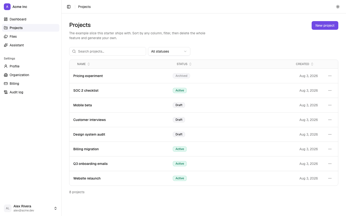
default
Balanced and neutral. Moderate density, a subtle elevation scale, Geist Sans throughout. The one to keep if the product's character comes from its content rather than its chrome.
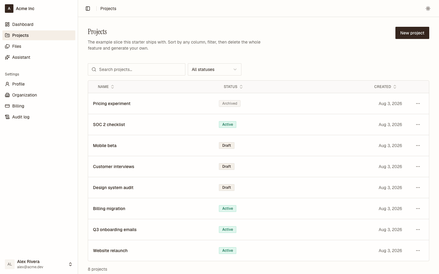
editorial
A serif display face, warm paper rather than white, generous vertical rhythm and no elevation at all — a rule does the work a shadow would. Ink rather than blue, so it reads as print rather than as a dashboard. For content-first products, knowledge tools, anything where the writing is the product.
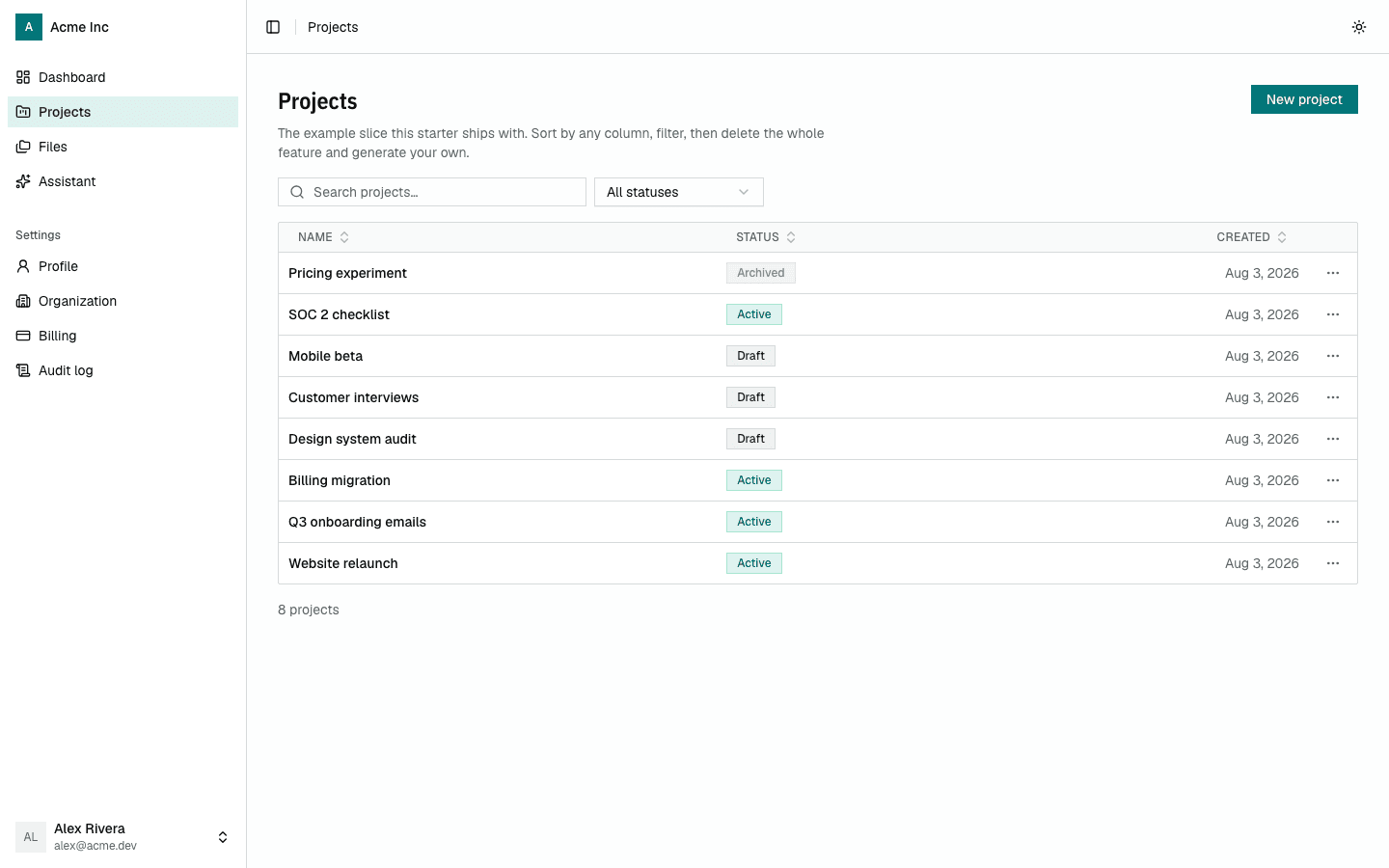
dense
A condensed display face, the tightest cells and controls in the set, near-monochrome surfaces and a chart ramp that stays legible in greyscale. For data-heavy products where the answer to "what else fits on this screen" is "more rows".
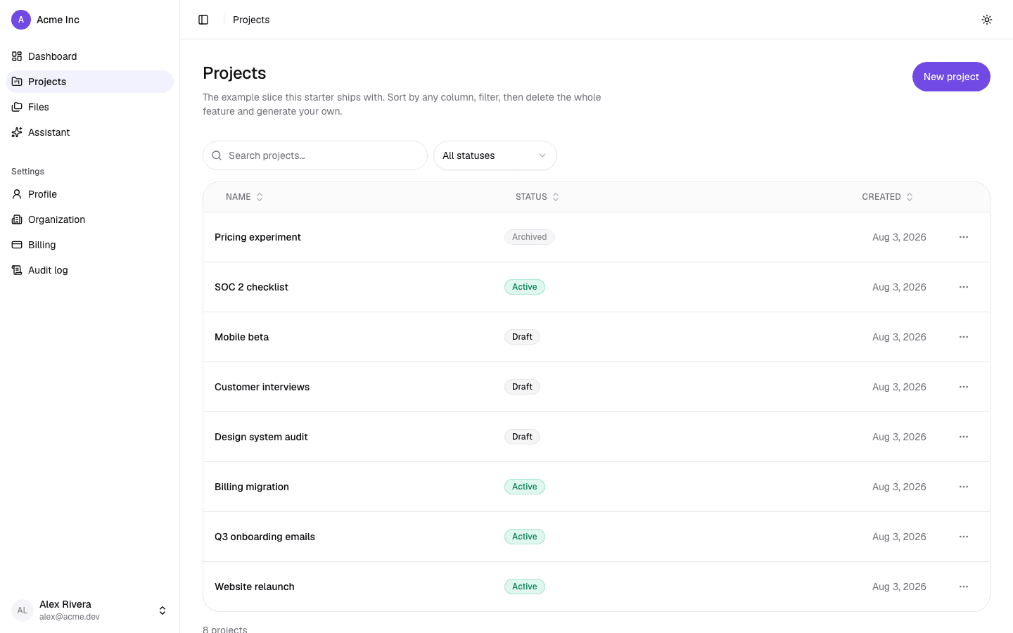
rounded
The default palette with every corner taken as far as it goes — pill controls, a 1.5rem radius, roomy spacing, soft elevation. Shape is the whole idea, which is why the face and the hue are the default's. Friendly and calm without being loud.
This preset was called soft before 0.5.0. lq upgrade runs a codemod that
rewrites the attribute for you — a rename is otherwise silent, because the
attribute still parses and the selector simply stops matching.
playful
Saturated, chunky, and unmistakably not enterprise software. Two-pixel borders, hard offset shadows rather than soft blurs, a bold display face and a palette that commits. For consumer products and creative tools — anywhere "professional" is not the compliment you are chasing.
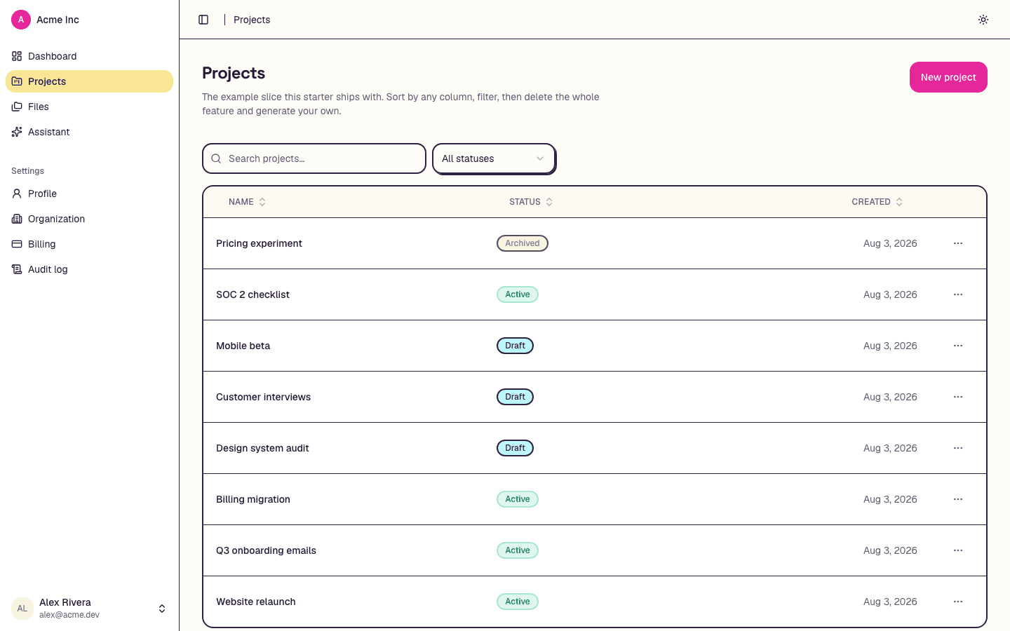
Switching
lq theme list          # what this project has, and which is active
lq theme set dense     # edits data-theme on the root element
lq theme set writes one attribute in src/app/layout.tsx. Everything else is
already in the stylesheet, which is why the switch is instant and why these
screenshots were taken by setting the attribute rather than rebuilding five
times.
Light and dark is separate and stays user-controlled through next-themes.
Every preset ships a .dark companion — and every preset's dark companion is a
full treatment, not four tokens over the stock neutrals, which is what dense
used to be.
Choosing, which is the part people skip
Pick before the first screen. It changes every screen at once, and it is the one design decision that cannot be retrofitted cheaply — by the time there are twenty pages, switching means re-reading all of them.
| preset | reach for it when |
|---|---|
default | a balanced product with no strong opinion — the safe choice, not the free one |
editorial | the writing is the product: content tools, knowledge bases, anything long-form |
dense | operators live in it all day and a screen should hold twice as many rows |
rounded | approachable and calm — onboarding-heavy, self-serve, non-technical users |
playful | consumer or creative, where looking like enterprise software is the failure |
We know this step gets skipped because we measured it. Six products were built
on this template by independent agents across two rounds, and all six shipped
default — not after comparing, but because nothing ever asked. The scaffold
now prints lq theme list in its post-install output and AGENTS.md names the
choice under "before your first feature".
The tokens a preset can move
Colour is the obvious one. These are the others, and they are what make two presets look like two products:
| token | what it controls | read it as |
|---|---|---|
--font-display-face | the heading face | font-display |
--display-tracking, --display-weight | how headings are set | tracking-(--tracking-display) |
--radius | corner rounding | rounded-lg and friends |
--border-width | border weight | border |
--elevation-xs|sm|md|lg | the shadow scale | shadow-sm, shadow-md |
--control-height, --control-height-sm | button, input and select heights | h-control, h-control-sm |
--cell-padding-x, --cell-padding-y | table rhythm | px-cell-x, py-cell-y |
--section-gap | vertical rhythm between page sections | gap-section |
Three things about this list are load-bearing, and all three have gone wrong once:
Every one of these must have a value in :root, not only inside a
[data-theme] block. A var() that resolves to nothing is invalid at
computed-value time, and the property silently falls back to its initial value.
That shipped: with no preset selected, py-cell-y resolved to nothing and table
rows collapsed to bare line-height. Nothing errored.
A face a preset switches to must be loaded in src/app/layout.tsx, and the
font variables must sit on the same element as data-theme. Custom properties
inherit downward only, so a preset setting --font-display-face from :root
cannot see a variable defined one level lower. Getting this wrong is silent —
the heading simply keeps the old face.
--border-width needs the utility override at the bottom of globals.css.
Tailwind 4 generates .border { border-width: 1px } with the width baked in and
offers no theme key for it, so the token would be decorative without that rule.
This page claimed presets varied border weight for two releases while no such
token existed anywhere — the claim is true now, and the override is what makes
it true.
Components
Thirty-one shadcn primitives, thirteen application components with thirty exports between them, thirteen marketing blocks, and the rule about which layer you reach for.
The marketing surface
One config file holds every word on the public site, thirteen blocks render it, two layouts arrange it, and the SEO helpers keep the structured data agreeing with the page.